
There are things to like about the new New York Jets uniforms, unveiled Thursday night at an event in Manhattan. And they’re all mostly undone by the jersey tops, the biggest and most important piece of the ensemble, which invite the worst possible comparison an NFL uniform can receive: Arena league.
The helmets are entirely green now, and shiny as heck, and they look great. The team also sports a new, lighter shade of green that is definitely an improvement on the old. (The Jets claim that this shade was designed specifically to look good on TV, which, we’ll see. The new green also gets a name, which is normal, but so do the secondary colors, which is not, considering that they’re, uh, white and black. Say hello to “Gotham Green,” “Spotlight White,” and “Stealth Black.” Just because you’re paying the design team a lot, you don’t have to accept every bit of marketingese they sell you.)
“It’s a statement about the future. I think it’s a statement about how we want to be perceived as a little bolder, a little more innovative and a little greater,” said Jets President Neil Glat. Well, no, it’s a ploy to sell merchandise, but let us take the aesthetics on their own merits. Here are the road, home, and alternate uniforms, pictured on the Jets’ site, which has a whole mess of photos from every angle.
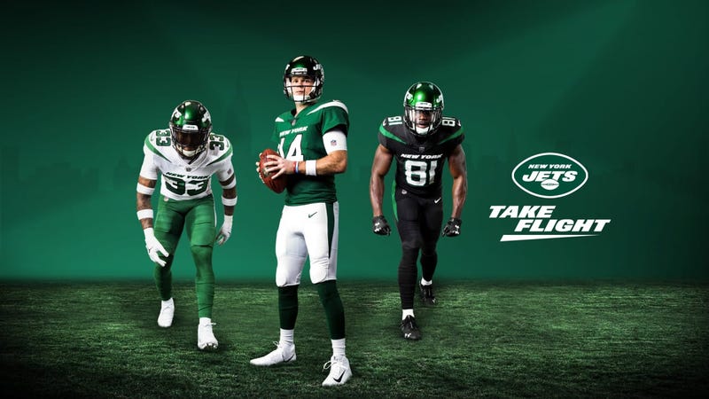
I hate the jerseys. Hate em! Every detail, from the wings (or whatever) on the shoulders to the squished “New York” above the numbers on the front, screams generic. Generic, but also, somehow, extremely 2019, and even if these looked good now, they’re still going to look extremely 2019 in five or 10 years.
Advertisement
I especially hate the numbers. The font is “edgy and unique,” according to the Jets, but I guess words can mean a lot of things. The sans-serif font feels amateurish and looks particularly weird for the 1s, and the only saving grace of the black outline on the numbers for the home jerseys is that it’s not nearly as unappealing as the use of green-outlined-in-black on the road unis.

Black is entirely new to the Jets’ color scheme, and there’s not anything here it makes better—least of all, the new black alternate uniforms, which look too much like ripoffs of the Eagles’. Earlier in the decade, seemingly every American sports team sported a black alternate, and most have wisely since ditched or downplayed them. It’s extremely Jets of the Jets to hop on the trend now, too late.
Advertisement
Look, your mileage may vary with this stuff. Maybe you like the new Jets uniforms. Maybe your kid does! (I can already picture the alternate selling well around here.) Don’t let anyone else’s opinion stop you from liking things. But also, if you’re going to be shelling out 150 bucks for a jersey, you have the right to own something that won’t someday prove regrettable.
https://deadspin.com/these-new-jets-uniforms-s-u-c-k-suck-suck-suck-1833833820
2019-04-05 13:19:00Z
52780259302686
Tidak ada komentar:
Posting Komentar